
Why do some email newsletters get ignored while others drive clicks almost instantly? The difference is rarely luck-it is usually the template.
A high-performing newsletter does more than look polished. It guides attention, sharpens the message, and makes the next click feel obvious.
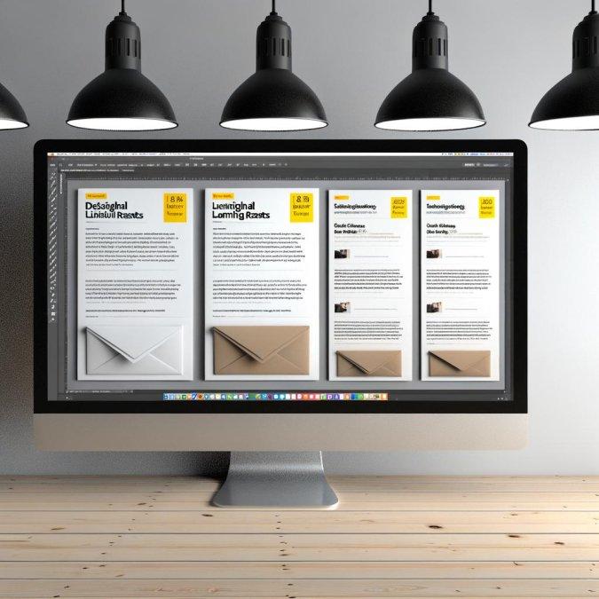
In this article, you will see five proven email newsletter templates designed to lift click-through rates across promotions, product updates, and content campaigns. Each one is built around the same principle: less friction, more action.
If your open rates look decent but clicks stay flat, the structure of your emails may be the real problem. The right template can turn passive readers into engaged visitors without writing more copy.
What Makes High-CTR Email Newsletter Templates Work
Why do some newsletter templates get clicks while others get skimmed and closed? The difference usually isn’t design polish alone; it’s whether the template reduces decision friction. High-CTR layouts guide the eye to one obvious next step, keep cognitive load low, and make the click feel like the natural continuation of the email rather than a separate commitment.
In practice, the strongest templates do three things well:
- They create hierarchy fast: a tight headline, one dominant visual or offer block, and a CTA that appears before attention drops.
- They match message to intent: product update emails behave differently from curated roundups, so the structure has to fit the reader’s reason for opening.
- They preserve momentum on mobile, where most CTR problems start because buttons, spacing, or copy blocks are awkward to tap through.
Small things matter. I’ve seen teams rebuild a newsletter in Mailchimp or Klaviyo, then wonder why clicks stayed flat; the issue was not the template builder, it was competing CTAs in the top half of the email. When a SaaS company sends a feature announcement with “Read more,” “Watch demo,” and “Book call” stacked together, many readers choose none.
One quick observation: readers rarely reward cleverness. They reward clarity.
A working template also respects scanning behavior. That means descriptive button copy, preview text that extends the subject line, and modular content blocks that can be removed when an email doesn’t need them. If a template cannot stay clear when shortened, it usually won’t perform when expanded either; that’s a warning worth taking seriously.
How to Structure 5 Email Newsletter Templates for More Click-Throughs
Start with the click path, not the copy. Before drafting any newsletter template, decide what single action the reader should take, then build every block around reducing friction to that action: subject line sets expectation, opening confirms relevance, body removes doubt, CTA names the next step. If the email asks readers to “learn more,” “read the blog,” and “book a demo” at once, click-throughs usually split and weaken.
One practical way to structure these templates is to assign each a job inside your funnel. For example, in Mailchimp or Klaviyo, I’ll often map templates like this:
- Update template: one key announcement, one supporting proof point, one CTA.
- Curated content template: three links max, ordered by reader priority, not by publish date.
- Offer template: problem first, offer second, deadline last.
Short matters.
A mistake I see a lot: the strongest link sits below a long brand intro or a giant hero image that pushes the CTA out of view on mobile. In a real campaign for a SaaS onboarding sequence, moving the primary button above a testimonial snippet lifted clicks simply because readers no longer had to scroll to find the obvious next step. Not glamorous, but it worked.
And honestly, readers scan in a hurry. Structure for that behavior by using one dominant visual hierarchy, keeping link choices tight, and treating secondary content as optional rather than equal. If every section looks equally important, none of them earns the click.
Common Email Newsletter Template Mistakes That Lower Click-Through Rates
Most newsletter templates underperform for boring reasons: they make clicking feel like work. A layout can look polished in Mailchimp or Klaviyo and still bury the only action that matters under a hero image, two competing buttons, and a block of copy that forces the reader to scan instead of decide.
The mistakes that hurt click-through rates usually come from template habits, not copy alone:
- Too many priority levels: headline, subhead, promo banner, product grid, social icons, and footer links all fight for the same attention.
- CTA mismatch: the button says “Learn More,” but the section clearly wants a purchase, booking, or download.
- Mobile stacking issues: what looks clean on desktop becomes endless thumb-scroll on Gmail mobile, pushing the main link below the fold.
I see this often in ecommerce sends: a brand uses a magazine-style template with six products and three offers in one email, then wonders why the campaign gets opens but weak clicks. When we cut it to one product story, one supporting proof point, and one button, the path became obvious. Simple wins.
Another quiet problem is visual dead weight. Spacer blocks, oversized logos, and decorative dividers consume the first screen without helping the reader decide; in Litmus previews, these are usually the templates that look “premium” but lose urgency.
And yes, personalization can backfire. If dynamic blocks pull in irrelevant recommendations or broken fallback content, trust drops fast and people stop tapping. A template should reduce decision friction, not showcase every module your ESP can technically render.
Expert Verdict on 5 Email Newsletter Templates That Increase Click-Through Rates.
The strongest newsletter template is the one that makes action effortless. High click-through rates rarely come from better design alone-they come from matching the template to the reader’s intent, the offer’s clarity, and the moment in the customer journey. Choose a format that highlights one primary action, removes distractions, and supports fast scanning on mobile.
- Use simplicity when the offer is clear and urgent.
- Use structure when readers need comparison or context.
- Use testing to validate what actually drives clicks for your audience.
The best next step is practical: pick one template, align it to one campaign goal, and measure clicks before making it more complex.

Dr. Alistair Vance is a leading expert in operational efficiency and digital transformation. With a Ph.D. in Business Systems, he specializes in bridging the gap between complex corporate workflows and seamless document automation. Through AIM Solutions, Dr. Vance provides professionals with high-performance templates designed to minimize administrative overhead and maximize strategic output.